Getting people to “get it” in just 45 minutes – the promise and perils of data visualization


My friend and colleague, Mark Palmer, an Analytics, Data Science & Data Products executive, recently presented me with this challenge: Suppose you had 45 minutes to present to senior management at a big company, and your goal was to get them to see the value in making sure everyone in the organization was fluent in being able to understand charts and dashboards.
What would you share with them?
What would you do to get them to have that “come-to-Jesus moment” where they see the advantages of data visualization and give you complete buy-in?
Here’s what I’ve come up with so far:
- What are the “cool kids” doing?
- Reducing time to insight
- Color is good, bars are better
- The dark side of data visualization
1. What Are the Cool Kids Doing?
I’d start by quoting research studies that prove that organizations that have embraced data visualization significantly outperform those that have not. In other words, if you don’t get good at this stuff your competition is going to trounce you.
For example, a recent Forrester research report claims that “data literacy efforts lead to significant benefits in increased innovation, greater customer and employee experience, and more.”
There’s also an MIT Center for Information Systems research briefing that states that “In our analysis of over one thousand companies, those that were more effective at dashboarding were also better at most other important measures, including innovation, growth, and margin relative to industry.”
Incidentally, as one of the three authors of The Big Book of Dashboards I so want the MIT findings to be true, but I worry that folks in the audience will question the objectivity of the studies. For example, Tableau / Salesforce commissioned the Forrester study and if I were in the audience I would think “the tool vendor has a lot to gain from this, and they paid for the study.” As for the MIT briefing, for me the jury is still out as I need to see the full study as I wonder if a lot of the responses are self-reported vs. objectively measurable. For example, how do you measure “being good at dashboarding”?
Reader Action Item: I’m going to continue to search for beyond-reproach studies, and I can use your help. What studies have you seen that make a strong case for the business benefits of data visualization?
2. Reducing time to insight
Maybe the “if you don’t get good at this, you’re toast!” discussion is all the executives need, but I suspect demonstrating the data visualization’s advantages and overall effectiveness to the spreadsheet-only crowd is worthwhile. This is the thing I’ve been figuratively screaming about for years: if you are just using spreadsheets your organization is working way harder than it needs to be.
Here’s an example I show in my workshops. There are 17 Product Sub-Categories and four regions in the spreadsheet below, yielding 68 different cells. I ask attendees to see if they can find the most profitable combination of sub-category and region, as well as the least profitable.
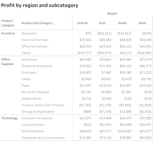
It takes people on average about 20 seconds to come up with answers, and only 80% get it right (Office Machines in the South and Tables in the East.)
I then show a variation on the spreadsheet that uses color coding to make it easier to see the higher and lower values.
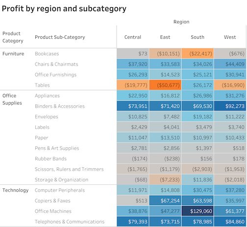
With the color coding it takes people around three seconds, and everybody gets it right.
Now think of how many times people must contend with spreadsheets like the one above. If you could reduce the time to process and the number of errors that easily, wouldn’t you?
This color-coded spreadsheet goes by different names. In Excel, it’s called conditional formatting. In Tableau, it’s called a highlight table.
My fellow authors and I call this technique the gateway drug to data visualization as it’s an easy way to get people hooked on how transformative good data visualization can be without taking away their beloved spreadsheet.
3. Color is good, bars are better
People are usually leaning in at this point, so I next show this highlight table of tech support calls by day of the week and hour of the day.
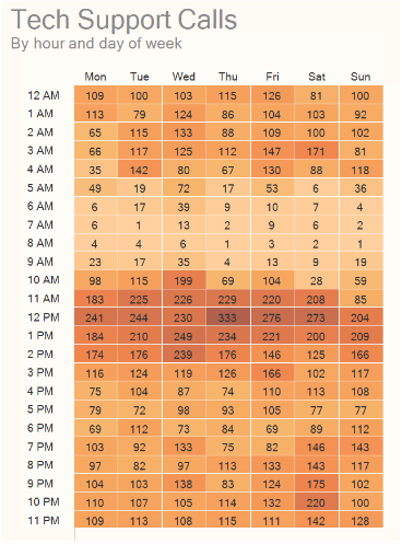
It’s easy to see where there’s a concentration of calls, but then I ask people to tell me on what day of the week we get the most calls and at what hour of the day do we get the most calls.
That is not so easy to answer, but if we add a marginal histogram (for now just think of it as a fat bar chart around the margins) the questions are easy to answer.
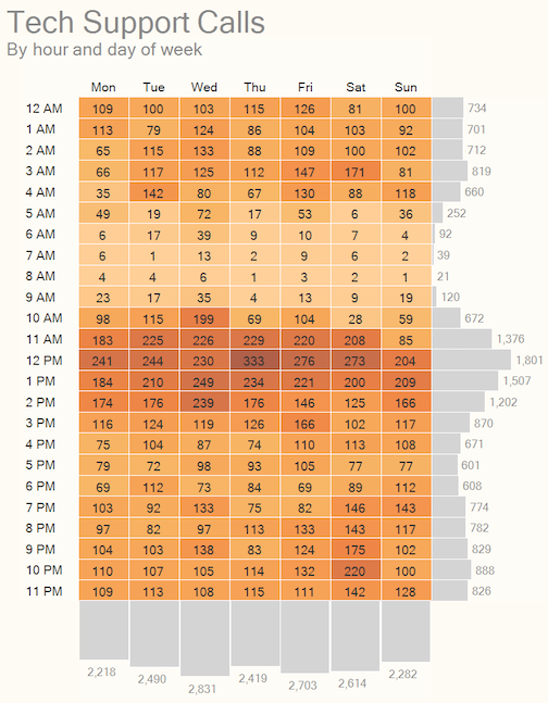
If you’re wondering why you would not just add totals along the right side and bottom, the answer is that you can, but the results will not be as effective.
For one thing, coming up with a color coding for the totals (big numbers) that doesn’t compete with the colors for the inside of the table is tricky. But even if you could do that, let me show you how much better bars are for comparing values than color coding.
Let’s consider just 10 AM and 11 AM using color coding.
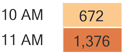
Yes, we can see that 11 AM is about twice as large because there are numbers right there.
Suppose you remove the numbers.
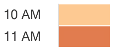
Okay, now it’s impossible. Sure, 11 AM is darker, but can you see that it is twice as orange-y as 10 AM?
Of course not.
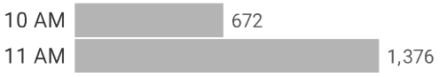
Now let’s try the same thing with bars.
Now let’s remove the numbers.
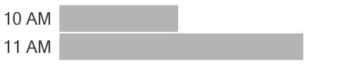
It’s easy to see that the bottom bar is about twice as long as the top bar.
This leads to a discussion as to why we see so many bar charts in newspapers, websites, business reports, and so on. Humans are remarkably good at using bar charts to make accurate comparisons, and without ANY training. We’re just wired to be able to do this.
That’s not the case with color, or comparing the area of circles. Yes, packed bubble charts look cool, but people are terrible at estimating sizes with them.
If you’re curious, you can try for yourself at http://bigpic.me/estimate.
Callouts:
- People don’t want to look foolish
I think one of the reasons that people avoid using charts and dashboards and prefer spreadsheets is that they are not yet comfortable interpreting graphs, and they don’t want to admit this. I get that. Nobody wants to come off as ignorant. But rather than say “I’m confused by this… can you help me understand what it is and how it can be helpful?” people instead cling to their beloved, familiar, but not terribly insightful spreadsheets.
Management must make it safe for people to ask questions. Better yet, management should make learning these things a priority (more on this a little later.)
- How To Make the Example Hit Home
Amanda Makulec, Executive Director at The Data Visualization Society, suggests fashioning an example using the company’s own data. Having a good generic example is great, but doing the magic with the organization’s own data is likely to resonate a lot more.
Key takeaway
Look at how much easier it was to answer questions using some simple visualizations vs. a table full of numbers.
And look how easy it was to decipher the charts, with very little guidance. Learning to be fluent in reading charts and dashboards isn’t hard.
4. The Dark Side of Data Visualization
At this point I won’t have that much time left in my 45 minutes, so I want to make sure senior management knows about the dark side of data visualization. Yes, when done well it can lead to faster insights and better decisions. But it can also mislead people.
Consider the bar chart below.
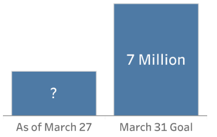
If the bar on the right is 7 million, what would you estimate the bar on the left is?
Certainly less than half.
So, what would you make of this graphic if you saw it on the nightly news?
Well… it just can’t be right. Either the numbers are wrong, or the length of the bars is wrong.
Or somebody is messing with the graph so the value axis doesn’t start at zero.
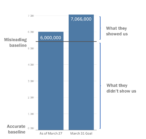
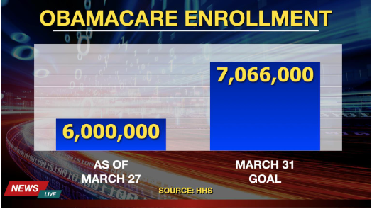
This misuse of bar charts is all too prevalent. Here’s an example from the Hungarian Central Statistical Office.
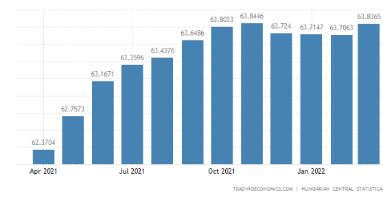
Wow… what an increase from April 2021… but wait. It is in fact a very small increase but it’s been manipulated to look large by changing the value axis so that we don’t start at zero.
Here’s another example, from Hungarian Prime Minister, Viktor Orban.
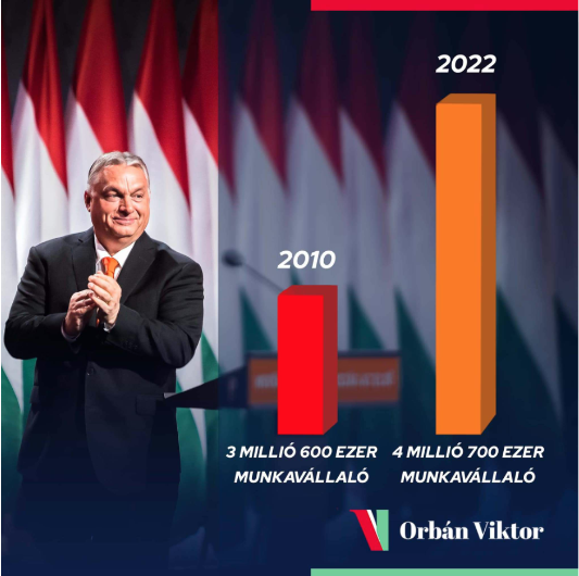
This is a chart showing job increases between 2010 and 2022. It sure looks like 2022 is more than twice as large as 2010, but if you look at the numbers (3.6M to 4.7M) you see it’s a far more modest increase.
You may be thinking “well, that’s Hungary… that wouldn’t happen in the USA.”
Please, think again. Look at this tweet from the Biden administration White House from October 2021.
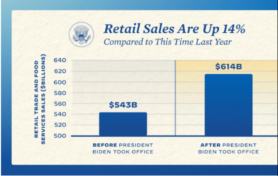
Yikes! The increase is commendable, but it’s a 13% increase, not a more-than-twofold increase as this chart appears to show.
Is it ever okay to have the value axis not start at zero?
Absolutely, but probably not with a bar chart. It’s a little too much to get into here, but I discuss this in depth in Chapter 4 of The Big Picture.
Key takeaway
I think everyone should be an informed consumer of charts and dashboards and should mistrust organizations that try to sell their services through this type of chart manipulation.
But you also want to make sure your organization isn’t producing misleading charts. Indeed, some of the default settings for popular tools can easily lead novice data visualization practitioners astray. Don’t let that happen in your organization.
So, what now?
Let’s suppose my presentation succeeds and senior management is ready to invest in data visualization fluency. What should I tell them to do?
First, I don’t want to mislead them into thinking that it’s going to be trivial to teach people to create charts, dashboards, and great presentations. These are skills that takes time to master.
But being able to consume charts and use dashboards? I think everybody in the organization should be able to do this and it just isn’t that difficult (and is exactly why I wrote The Big Picture.)
I’d narrow it down to these goals:
- How do we get to a critical mass of people in the organization who are able to create good charts, dashboards, and presentations?
- How do we get everybody fluent in being able to read charts and use dashboards?
- How do we assess where we are right now?
There’s no one answer, but there are a lot of people and organizations that can help with this, including the ones below:
The Data Leadership Collaborative
Valerie Logan at The Data Lodge
Ben Jones at DataLiteracy.com
Tableau with its initiative to train 10 million people
The Data Visualization Society
Do you have ideas on how I can improve the presentation? I’d love to hear from you. Send me a note at swexler@datarevelations.com.
Interested in learning more?
Checkout this video from Mark Palmer: The Business Value of Data Visualization.
Or register for this workshop: What Every Businessperson Needs to Know About Data Visualization